Masthead design
- jaydenurbach14
- Mar 28, 2023
- 1 min read
Updated: Apr 2, 2023
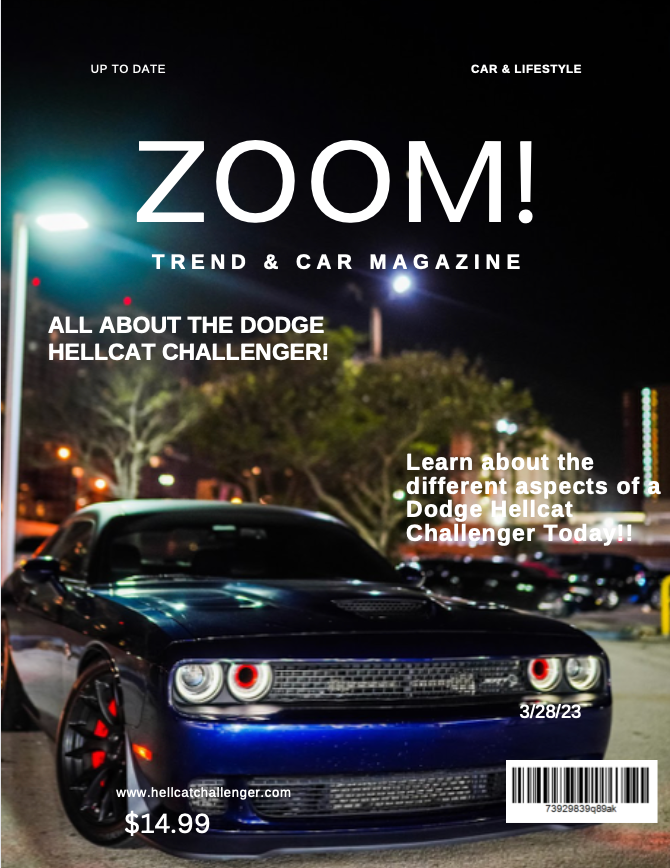
I'm energized to tell you all about my process for making a masthead design for a magazine called Zoom. The magazine is all about cars, so I brainstormed an idea that would be super cool however still being easy to read. The first thing that I did was choose a font for the masthead. I went with a beautiful sounding San Serif text style called Summer. It looks super smooth and clean, which is crucial for a magazine made about cars.
Using the website that my teacher gave us, I played around with the Different sizes of the font to see which would best fit my magazine. I wanted the masthead to see like it was zooming down the page, a bit like a car dashing down the street. I then chose the color black because it just simply felt right. Especially when talking about luxury and sports car. I also wanted to try and give off a vibe in the title, I feel like a bold black color would give of the vibe of being in a nice black car. In general, I think the masthead turned out truly amazing. It's advanced, it's cool, and really fits with the genre.
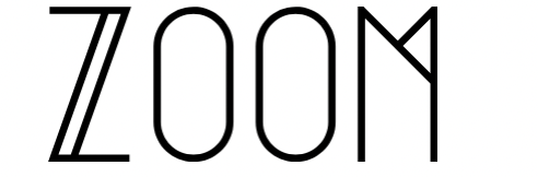

Above is a picture of a Magazine Using a san-serif font that I plan on using as preference and making very similar to!
Comments